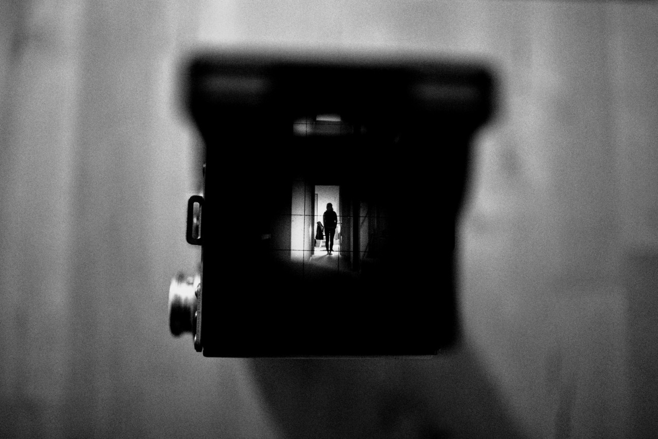
Photograph by great photographer Louis Blythe, www.unsplash.com, or visit his website www.louisblythe.com.
My Fantastic 7 Slide Design Tips For You
“I think there is a strong negative correlation between the amount of words on your slides and the amount of grey matter in your brain.”
Albert Einstein*
Let me start with the story of the most successful software used all around the world to project slides during a presentation: PowerPoint. This history making software was developed by Robert Gaskings and David Austin between 1984 and 1987 for the Apple Macinthosh Computer and bought by Microsoft for the even then modest sum of 14 million $. Marketed together with every new version of the flagship-software Windows, over the years it has become the most used and most hated business presentation software in the world.
Heavily criticised today by Jeff Bezos, Edward Tufte and many other start up gurus and authors and brand marked with the term “Death by PowerPoint”, its inventor Robert Gaskings defends it with a quote from Shakespeare:
“I say what Queen Gertrude says to Polonius (in Act 2 of Shakespeare’s Hamlet): ‘More matter with less art!’ “
Well, in my humble opinion Gaskings couldn’t be more wrong when saying that PowerPoint in order to convince today needs “more intellectual substance and less rhetoric and gratuitous decoration” (from an HULT | BENTO interview with Gaskings).
In fact both my experiences as a Professor for presentation and as a business consultant for communication have convinced me of the exact opposite: Slides need more emotions, more photographs, more symbols and less text, less charts and less data today.
I regard and use PowerPoint, Keynote, Curator and other presentation software as visual media, emotional media, and most important of all, co-creating media for my presentations. To make my point even clearer: A good presentation cannot be completely understood by looking at the slides alone. A presentation is not the presentation of a report through the lens of a projector, just as you do not use a projector to read a report at home (or do you?). Reports, articles and books are best read on paper with a cat onto your lap or a dog at your feet, in the garden in spring time and by the fireside in winter, that is, with a lot of time to think about it and take notes. Projecting slides full of sentences and data are only creating a data maze that will lead your audience nowhere – an unpleasant event that will fortunately be forgotten, in an act of understandable self defence, five minutes after its very welcomed end.
Let me use a metaphor (I love metaphors!) to illustrate my approach: You are the pilot of your presentation and your slides are the co-pilot that has to touch people emotionally and convince your audience in a non-rational way. Or to say it in the style of the movie Jerry Maguire: “You (the slides) complete me (the presenter)!”
How To Design Great Slides For Your Next Presentation
1. Make A Master Slide
A slide is like a room, you have to decide where to put your stuff. A grid, for example a nine field grid like the one below, helps you to decide where to position your text and pic or, if you use a picture covering the entire slide, how to “cut” it.


Original photograph by the great photographer Clem Onojeghuo, www.unsplash.com, or visit his website www.clemono.com.
As you can see, in this case I have chosen a 4:3-slide format, I have zoomed in for more proximity and made a new cut of the photograph, I have chosen a 9-field-grid and positioned the woman on the picture not in the exact middle but slightly to the left and with her right hand touching one of the four crossing points (which funny enough are called “Power Points”). Than I have chosen a font and positioned my text (actually it’s my claim in this example) over the upper horizontal line on the left (where people use to start looking for information and also reading) in a way that it becomes connected with the left hand of the woman, and even more important, with her look.
Thus I have created a test-slide that I can improve until I can use it as master-slide for all my slides of this specific presentation, where freedom and self realisation might be the topic.
As you can see my colleagues and i do our best to let the centre of the slide ‘breath’, to create a Tao in the centre, a place that is relatively empty but contains energy that does emanate to all the other sections of the room.
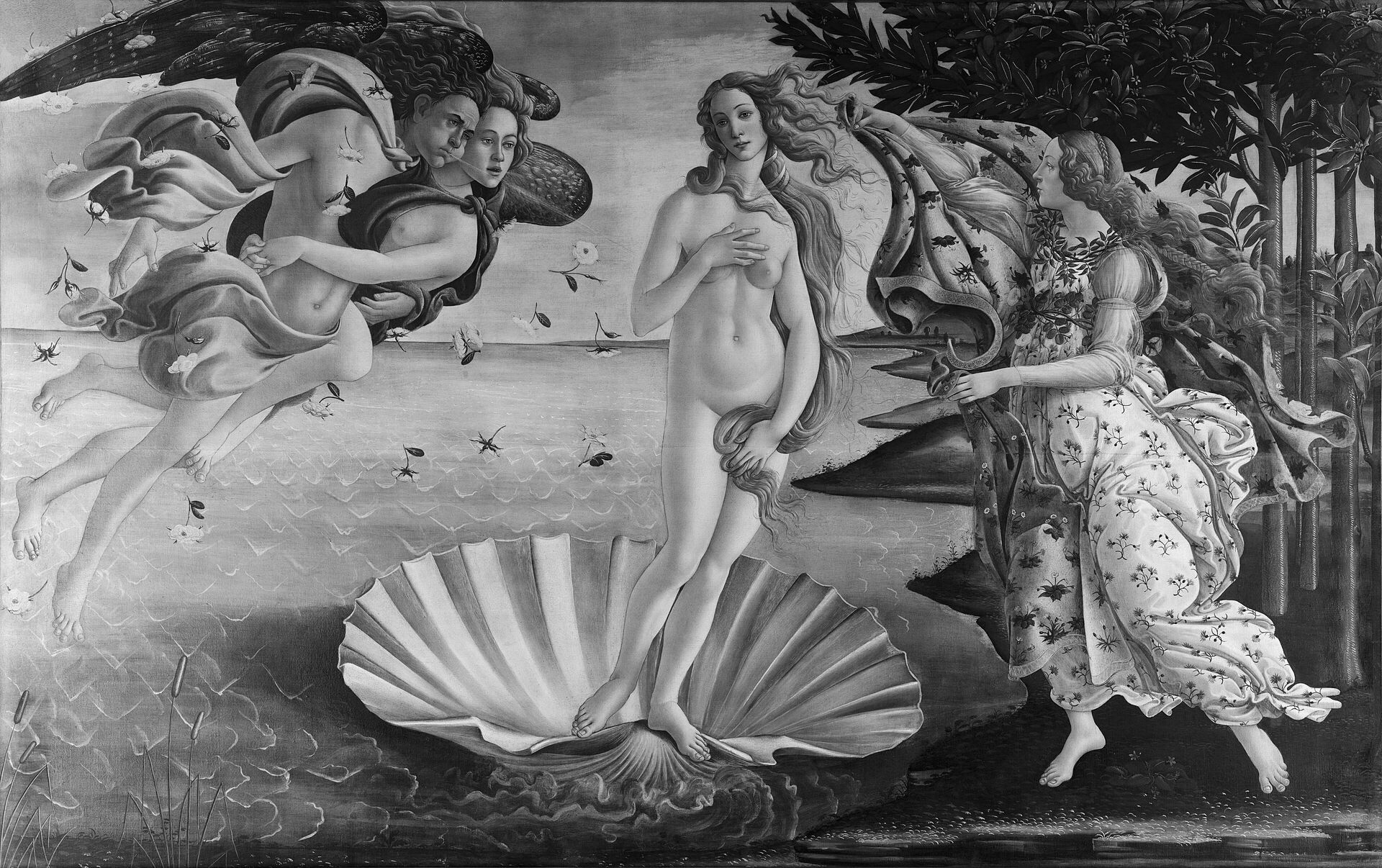
This might seem counterintuitive, we tend to assume that the most important thing in a room should be located in the centre of it, in the centre of attention. But a central positioning makes slides (as well as portraits) static, as you can see here by taking a look at the marvellous Venus of Sandro Botticelli. This is his original, the Venus is slightly balanced to your right and not in the centre:

This is how the painting would look with the Venus in the exact centre:
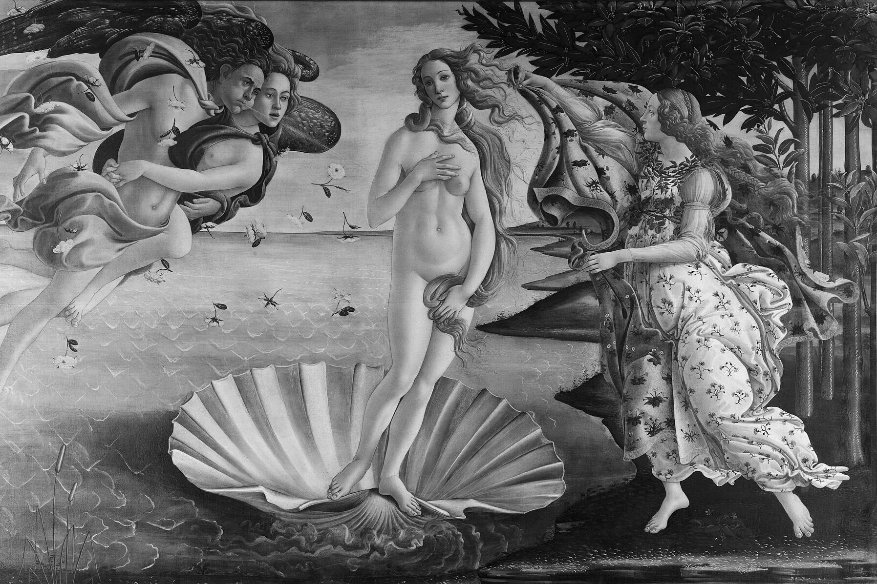
Can you feel how heavy and narrow minded it has become? And this is how I would use the picture on a slide, with the Venus even more positioned to the right side of the slide:
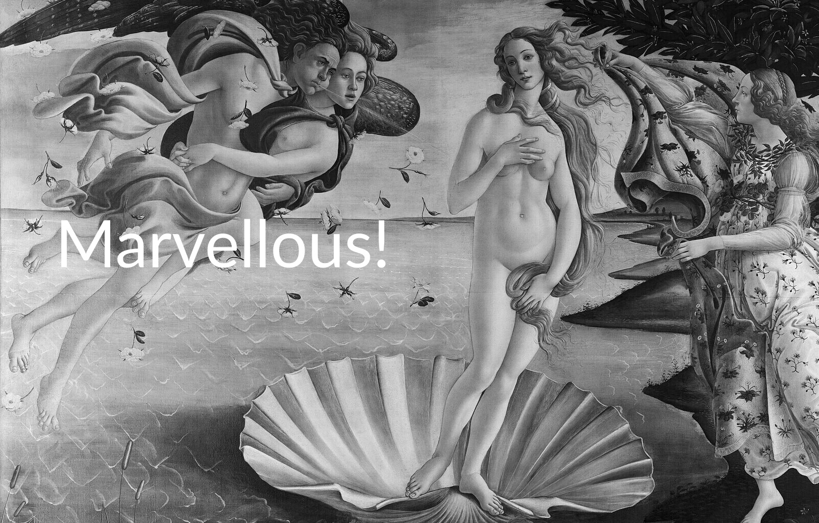
Original Photograph courtesy of Wikipedia.
Slide design is an art, my friend, and the rules of classic painting and designing apply to it as well.
2. Limit Your Text And Bullet Points
Which brings us to our second slide design tip. As you have seen above, my slide examples contain very little text. Of course it’s not always possible to be that essential, but you should always try to use very little text and bullet points. So do not cramp your slides with the endless repetition of your firm’s logo, the date of the pitch or the sources of your material. Create a detailed handout instead, it will unburden your slides. Every single slide should contain only one thing that you want your audience to remember, one number, one word, one feeling, one cause or one effect.
3. Use High Quality Photographs
Choose only the best photographs for your slides, that means only photographs with a very high resolution, with good contrast and a favourable forground-background-ratio. A photograph must tell your audience in less than a second what it wants to express, which emotion and which thought it wants to deliver. That is why most of your slides should show us people and their faces. Human beings are emotionally wired to feel with other people, not with objects or buildings. Therefore show us people, and real people for that matter, not some strange third rate stockmen or rubber aliens.
4. Create A Colour Guide For Your Slides
There are cold and warm colours, juvenile and old colours, precious and shabby colours, stimulating and calming colours. What do you want your audience to feel and, even more important, how do you want them to feel about you and your organisation? Most firms have a Corporate Design Handbook and predefined slides that mirror these choices. But if you are free to choose your slide-design from the scrap, think about the room where your pitch will be delivered. In a dark room a deep blue slide (or a slide with dark photographs) with white text on it will work fine, in a room with some light a traditional white slide (or a slide with bright photographs) and with black text on it will be the better choice.
Every slide you use in a single presentation must be related to all the other slides, meaning that your slides must seem to come from the same “slide-studio” (use the slide sorter to have a good look at your overall slide design). That is also true for the colours you use. There must be one lead colour in all of them, either white or black (which are not really colours by the way) or red, yellow, green or blue. Of course it’s not easy to find good photographs with the same lead colour but outstanding websites like unsplash.com will help you in this important task.
5. Choose The Right Font
A font is not just a tool to make your words visible on the slides, your font gives your words an additional meaning that will – probably mostly unnoticed – influence your audience in a subtle but non the less very important way. Are you to trust? Innovative? Competent? Dynamic? The font you use will tell them. So it’s not just about choosing a Serif-font like “Times” or a Sans-Serif-font like “Arial”, it’s not just about making it big enough (point 30 or more), it’s about choosing a font that tells people who you are and how you see the world. “Arial”, the Sans-Serif-font mentioned above and the one most often used by my students, looks appalling to me: It’s cold, authoritarian and not very elegant. But at least it’s modern. It might work in a presentation about a new USB-stick but definitely not when it comes to history, teaching, culture and similar topics. Do you see where I am heading? There is not the single “right font”, you must choose a font for your presentation that can stand for your values, for your firm and also for the specific message you want to deliver the day of your pitch.
6. Reduce Your Charts To The Max
Most charts used in business presentations are copied from books, articles and reports and are therefore often containing too much data. Make new charts and reduce the bars, lines and pie slices to the ones that really matter. Keep your charts 2D and use the colours to create contrast and clarity. Be truthful, it’s very easy to make charts that are right in the detail showed and all wrong in their overall meaning. Do not manipulate your audience with arbitrary chosen periods of time or quantities.
7. Think And Act Like An Artist
My final advice is maybe the most important: Think like a movie director, like a sculptor, a painter or designer when it comes to your visuals. Movie director Martin Scorsese once said that cinema is all about “what’s in and what’s out of the frame”. The same is true for your slides. Imagine that at the end of your presentation all your slides will be printed out, framed exclusively and handed out to your audience as precious take aways. Design them accordingly.
Please read: “Slide:ology” by Nancy Duarte.
Please read: “White Space is Not Your Enemy” by Kim Golombisky and Rebecca Hagen.
Please read: “Show and Tell” by Dan Roam.
*The quote at the beginning of this page is, of course, no orignal one 😉